
iPhone 6.7" (practical)
Recommended1290×2796 ~19.5:9
Common required high-end iPhone screenshot class in App Store Connect.
Use in toolApp Store · Image size
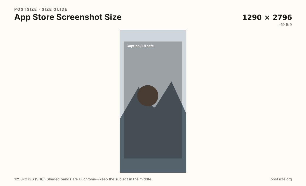
App Store screenshots for modern iPhones commonly use 1290×2796 (6.7"). Keep UI and captions inside the safe margin, then download before App Store Connect.
Browser crop · stays on your device
1290 × 2796
Add a photo to crop
Upload a device frame or UI capture—keep captions inside the safe margin.
Apple requires specific size classes per device family. Confirm the exact matrix in App Store Connect for your app version—this page ships practical masters to crop toward.
Export this for App Store upload.
1290×2796 ~19.5:9
Common required high-end iPhone screenshot class in App Store Connect.
Use in tool1284×2778 ~19.5:9
Alternate 6.5" class still listed for some localization sets.
Use in tool2048×2732 ~3:4
Tablet screenshot class—do not stretch a phone frame into iPad.
Use in tool| Asset | Pixels | Ratio | Notes | Action |
|---|---|---|---|---|
| iPhone 6.7" (practical) Recommended | 1290×2796 | ~19.5:9 | Common required high-end iPhone screenshot class in App Store Connect. | Use in tool |
| iPhone 6.5" | 1284×2778 | ~19.5:9 | Alternate 6.5" class still listed for some localization sets. | Use in tool |
| iPad Pro 12.9" | 2048×2732 | ~3:4 | Tablet screenshot class—do not stretch a phone frame into iPad. | Use in tool |
App Store Connect rejects screenshots that miss the required pixel class for the devices you support. A practical starting master for modern iPhones is 1290×2796 (6.7"). Older 6.5" slots often want 1284×2778.
iPad listings need their own ratio—commonly 2048×2732 for 12.9" class art. Stretching a phone screenshot into iPad looks wrong and may fail validation.
Keep marketing captions inside the safe margin. Status bars and home indicators still eat the outer bands when you show real device chrome.
Google Play uses different phone, tablet, and feature-graphic rules—open that guide instead of reusing an App Store export as-is.
Same full-screen frame—top and bottom UI chrome cover anything glued to the edges.
Tick these off against your crop preview—nothing is saved.
Similar-looking slots often use different ratios—do not reuse one export for all of them.
1290 × 2796
This page default.
1284 × 2778
Alternate phone class.
2048 × 2732
Tablet class.
1080 × 1920
Different store—separate guide.
| Surface | Typical size | Note |
|---|---|---|
| iPhone 6.7" | 1290 × 2796 | This page default. |
| iPhone 6.5" | 1284 × 2778 | Alternate phone class. |
| iPad 12.9" | 2048 × 2732 | Tablet class. |
| Google Play phone | 1080 × 1920 | Different store—separate guide. |
Apple updates accepted sizes when new devices ship. Crop here to get clean masters, then match the media manager’s required slots for your app version.
From this download to a live upload in a few minutes.
Download each size class you need.
Upload in App Store Connect → app → Previews and Screenshots.
Assign iPhone and iPad media separately.
Submit only after Connect shows green checkmarks for required slots.
Modern iPhone listings commonly need 1290×2796 (6.7"). Confirm the exact classes App Store Connect lists for your app.
If your app supports iPad, yes—use the iPad size class (often 2048×2732 for 12.9"). Do not stretch phone art.
Yes. Download the pixels, then upload in App Store Connect yourself.
No. Play has its own phone, tablet, and 1024×500 feature graphic rules.